Continuing CSS: Transforming Web Pages into Polished Design


Table of contents
Part 1 - Introduction
In my previous blog post, I explored the fascinating world of CSS properties and their role in web development. In this new blog post, I will continue and expand on the foundation of the previous blog starting with why it is called called a cascading style sheet.
Part 2 - The Cascade - Inheritance in CSS
In HTML if we have different rules that target the same element, for example, a paragraph tag, then we have to determine which one is higher up in the hierarchy and this method of working out which of the rules get applied and which ones get ignored is called cascade.
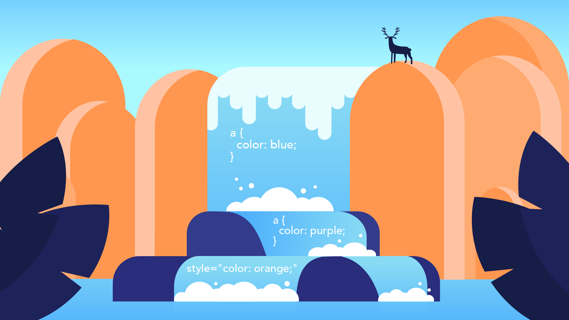
Imagine a waterfall where there are different stages of the waterfall.
So how the rule gets applied?
Imagine if this rule gets applied first, and then as the water falls down the cascade, it sees another rule that's applying to the same element.
In this style, number two will be applied.
p{
    color: red;
}
p{
    color: blue;
}
/* paragraph font color will be blue */
So multiple styles can be applied to the same thing, but because of the order of importance, the one that is the most important once you've finished the cascade is the one the user sees on the screen.
Four broad categories that determine the overall level of importance of the access rule are position, specificity, type and importance.
2.1) Position
li{
    color: red:
    color: blue;
}
I've got two rules applying to the same thing and setting the same property to set the color of the text to red, but I'm also trying to set it to blue.
Well, they both happen.
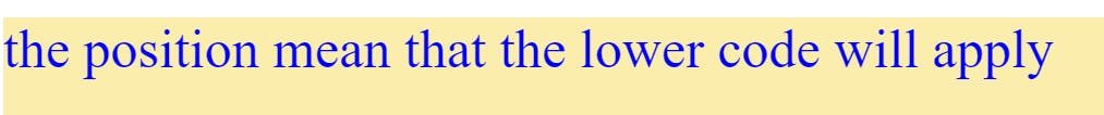
But the one that is lower down simply replaces the previous one.
2.2) specificity
li{
    color: blue;
}
.first-class{
    color: red
}
li[dragggable]{
    color: purple
}
#first-id{
    color: #FBEEAC;
}
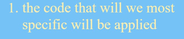
specificity refers to how specific a selector is in terms of the elements that are applying the CSS rule in this case, the id tag was the most specific selector.
2.3) Type selector
CSS is applied in three ways inline, internal and external. In terms of cascade inline is most important than internal and the last external.
2.4) Important
color: red;
color: green !important:
Important means this is most important and it does not matter what type of selector there it will be used.
Part 3- Combining CSS Selectors
CSS selectors can be combined to target specific elements on a web page. By combining selectors, we can create more specific rules to style or select elements. Here are some commonly used methods for combining CSS selectors:
3.1) Combining selectors with descendant selectors:
we can use a space between selectors to target elements that are descendants of another element. For example:
div p {
  color: red;
}
In this case, the rule will apply to all <p> elements that are descendants of a <div>.
3.2) Combining selectors with the child selector:
we can use the child selector (>) to select only the direct children of an element. For example:
ul > li {
  font-weight: bold;
}
In this case, the rule will apply to <li> elements that are direct children of a <ul>.
3.3) Combining multiple selectors:
we can combine multiple selectors by simply writing them one after another with no space in between. This selects elements that match any of the specified selectors. For example:
h1, h2, h3 {
  color: blue;
}
In this example, all <h1>, <h2>, and <h3> elements will have the color blue.
Part 4 - CSS positioning
CSS positioning is a technique that allows you to control the layout and positioning of elements on a web page. There are several positioning properties in CSS that you can use to achieve different layout effects. Here are the commonly used CSS positioning properties:
Static:
This is the default positioning value applied to elements. It means that the element is positioned according to the normal flow of the document. Elements with static positioning are not affected by the
top,bottom,left,right, orz-indexproperties.Relative:
Elements with relative positioning are positioned relative to their normal position in the document flow. You can use the
top,bottom,left, andrightproperties to offset the element from its normal position. Other elements will still respect the space taken by the relatively positioned element even if it has been moved.Absolute:
An element with absolute positioning is positioned relative to its nearest positioned ancestor. If no positioned ancestor is found, it is positioned relative to the initial containing block, which is typically the browser window. Absolute positioning takes the element out of the normal document flow, so it does not affect the position of other elements. The
top,bottom,left, andrightproperties can be used to position the element precisely.
4.1) Project
link> https://19kushagra.github.io/html-portfolio/public/7_CSS%20Flag%20Project/index.html
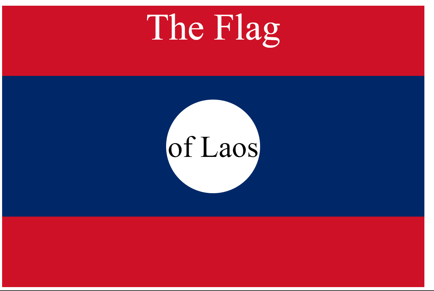
<!DOCTYPE html>
<html lang="en">

<head>
  <meta charset="UTF-8">
  <title>CSS Flag Project</title>
  <style>
    *{
      text-align: center;
    }
    .flag{
      height: 600px;
      width: 900px;
      background-color: rgb(206, 17, 38);
      position: relative;
      color: white;
    }
    #flag{
      height: 300px;
      width: 900px;
      background-color: rgb(0, 40, 104);
      position: absolute;
      top: 25%;
    }
    #circle{
      height: 200px;
      width: 200px;
      background-color: rgb(255, 255, 255);
      border-radius: 50%;
      position: absolute;
      top: 50px;
      left: 350px;
      color: black;
    }
    .flag > p{
      font-size: 5rem;
    }
    #circle > p{
      font-size: 4rem;
    }

  </style>
</head>
<body>
  <div class="flag">
    <p>The Flag</p>
    <div id="flag">
      <div id="circle">
        <p>of Laos</p>
      </div>
    </div>
  </div>
</body>

</html>
Part 5 - CSS Display and Media Queries
5.1) CSS Display
In CSS, the display property is used to control how an element is rendered and displayed on a web page. It determines the type of box or layout model that is used to present the element. Here are some commonly used values for the display property:
block: The element generates a block-level box. It takes up the entire width available and starts on a new line. Block-level elements, such as
<div>,<p>, and<h1>to<h6>, have a line break before and after them by default.inline: The element generates an inline-level box. It does not start on a new line and only takes up as much width as necessary to contain its content. Inline elements, such as
<span>,<a>, and<strong>, can appear within a line of text without causing a line break.inline-block: The element generates an inline-level box, but it behaves like a block-level element in terms of width, height, padding, and margins. It does not start on a new line and can have width and height specified. It is often used when you need elements to flow inline but also has block-level properties.
none: The element is not displayed at all. It is completely removed from the document flow, and it won't take up any space. This is commonly used when you want to hide an element dynamically using JavaScript or CSS.
flex: The element becomes a flex container, and its children become flex items. Flexbox is a powerful layout model that allows you to create flexible and responsive layouts. It provides control over the alignment, ordering, and sizing of elements.
grid: The element becomes a grid container, and its children become grid items. CSS Grid is another layout model that allows you to create complex two-dimensional layouts. It provides precise control over the placement and alignment of elements in rows and columns.
These are some of the commonly used values for the display property in CSS. The choice of display value depends on the desired layout and behavior of the element and its interaction with other elements on the page.
5.2) CSS float
CSS float is a property that allows you to position an element, such as an image or text, to the left or right of its containing element. When an element is floated, it is taken out of the normal document flow, allowing other elements to wrap around it.
img {
  float: left; /* or float: right; */
  margin-right: 10px; /* Adjust as needed */
}
5.3) Media queries
Media queries are a key component of responsive web design. They allow developers to apply different styles or layouts to a webpage based on the characteristics of the device or browser being used to view it. Media queries are written in CSS and use the @media rule to specify the conditions under which the styles should be applied.
max-width: This media feature is used to apply styles when the viewport width is equal to or less than the specified value. It sets an upper limit for the width of the viewport. Any width equal to or smaller than the specified value will trigger the styles within the media query. For example,@media screen and (max-width: 600px)will apply styles when the viewport width is 600 pixels or less.min-width: On the other hand, this media feature is used to apply styles when the viewport width is equal to or greater than the specified value. It sets a lower limit for the width of the viewport. Any width equal to or larger than the specified value will trigger the styles within the media query. For example,@media screen and (min-width: 768px)will apply styles when the viewport width is 768 pixels or more.
5.3) Project
link> https://19kushagra.github.io/html-portfolio/public/8_Web%20Design%20Agency%20Project/index.html
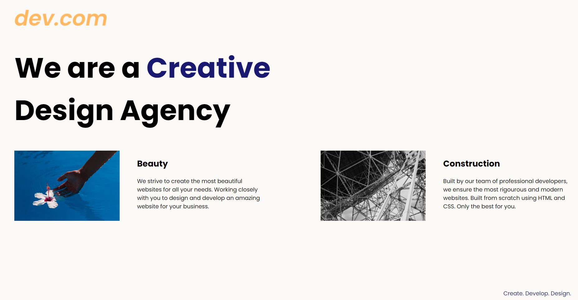
<!DOCTYPE html>
<html lang="en">

<head>
  <meta charset="UTF-8">
  <meta name="viewport" content="width=device-width, initial-scale=1.0">
  <title>Agency</title>
  <link rel="stylesheet" href="./style.css">
  <link rel="preconnect" href="https://fonts.googleapis.com">
  <link rel="preconnect" href="https://fonts.gstatic.com" crossorigin>
  <link href="https://fonts.googleapis.com/css2?family=Poppins:wght@400;700&display=swap" rel="stylesheet">
</head>

<body>
  <div class="main">
    <img class="logo" src="./assets/images/logo.png" alt="logo">
    <h1>We are a <span>Creative</span><br> Design Agency</h1>
    <div class="left card">
      <img class="tile-image" src="./assets/images/beautiful.jpg" alt="hand and flower in water">
      <h2 class="card-title">Beauty</h2>
      <p class="card-text">We strive to create the most beautiful websites for all your needs. Working closely with you
        to
        design and
        develop an amazing website for your business.</p>
    </div>

    <div class="right card">
      <img class="tile-image" src="./assets/images/construction.jpg" alt="metal structure">
      <h2 class="card-title">Construction</h2>
      <p>Built by our team of professional developers, we ensure the most rigourous and modern websites. Built from
        scratch using HTML and CSS. Only the best for you.</p>
    </div>

  </div>
  <footer>
    <p>Create. Develop. Design.</p>
  </footer>
</body>

</html>
body {
  font-family: "Poppins", sans-serif;
  margin: 50px 50px 0 50px;
  background-color: #faf9f6;
  display: flex;
  flex-direction: column;
  min-height: 95vh;
}
.main {
  flex: 1;
}

h1 {
  font-size: 5rem;
}
span{
  color: midnightblue;
  display: inline-block;
}
div{
  display: inline-box;
}
.tile-image{
  height: 200px;
}
footer {
  text-align: right;
  color: midnightblue;
}
Conclusion
This blog post covered various aspects of CSS, including the concept of cascading style sheets, the cascade and inheritance in CSS, combining CSS selectors, CSS positioning, CSS display and media queries.
Additionally, the blog featured two project examples. The first project demonstrated the creation of a CSS flag, showcasing the application of various positioning techniques and styling elements. The second project showcased a web design agency website, highlighting the use of CSS selectors, positioning, and media queries to create an appealing and responsive layout.
Moving forward, my next goal is to explore and learn about Flexbox Grid and Bootstrap. Mastering Flexbox Grid and Bootstrap, will enhance web development skills and efficiently create visually appealing and responsive websites.