CSS Flexbox: Building Flexible and Responsive Layouts


1) Introduction
CSS Flexbox is a powerful layout model that allows developers to create flexible and responsive designs easily. With its intuitive approach to aligning and distributing space among elements in a container, Flexbox has become an essential tool for modern web development. In this blog, I explore some of the key properties and concepts of CSS Flexbox to help you harness its full potential.
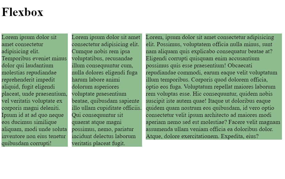
2) Display Flex
In CSS, the display property with the value flex is used to create flexible box layouts. It allows you to easily align and distribute space among elements in a container.
2.1) gap
The gap property, introduced in CSS Grid and later extended to Flexbox, sets the spacing between the child elements of a flex container. Let me provide you with an example:
     .container {
      display: flex;
      gap: 10px;
    }
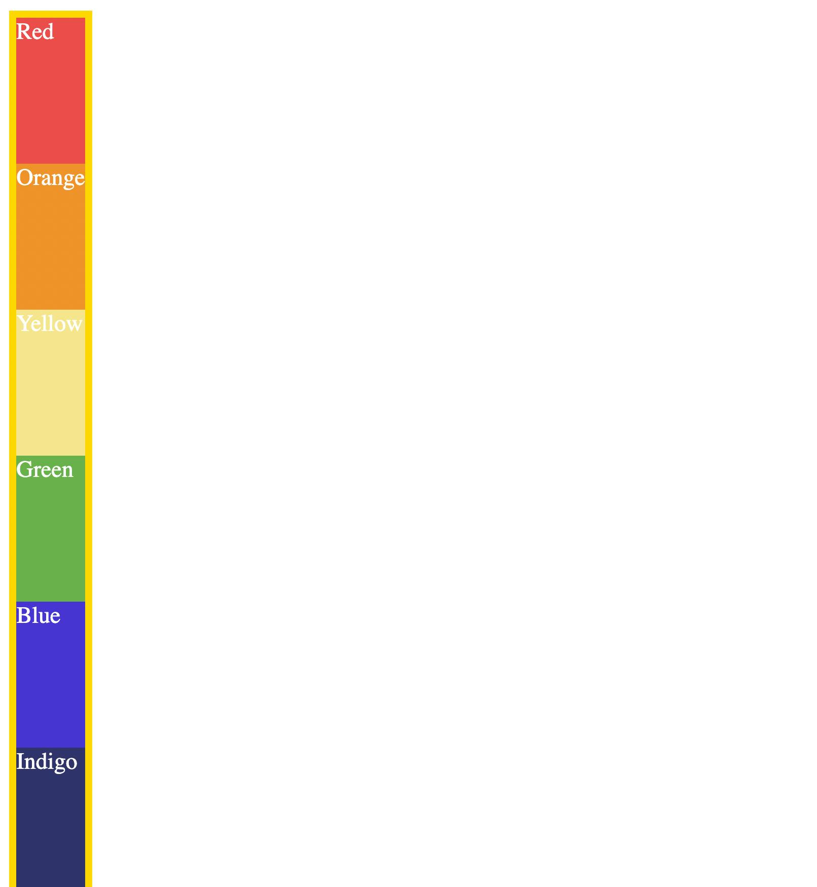
3) flex-direction:
flex-direction is a CSS property that determines the direction in which flex items are laid out within a flex container. It is used in conjunction with the CSS Flexbox layout module to control the arrangement of elements.
3.1) Flex-Direction property
The flex-direction property can have one of four values:
row: This is the default value. It arranges flex items horizontally in a row from left to right.row-reverse: It arranges flex items horizontally in a row but in reverse order from right to left.column: It arranges flex items vertically in a column from top to bottom.column-reverse: It arranges flex items vertically in a column, but in reverse order from bottom to top.3.2) flex-basis:
The
flex-basisproperty can be specified using various units, such as pixels (px), percentages (%), or relative units (em,rem, etc.). It determines the initial size of the flex item, which can be either a fixed size or a proportion of the available space.In CSS, the
displayproperty with the valueinline-flexis used to create an inline-level flex container. It behaves similarly todisplay: flex, but the container is rendered inline within the flow of the document, allowing other inline content to flow alongside it.3.3) display: inline-flex;
The CSS property
display: inline-flex;is used to define an element as an inline-level flex container. It allows the element to behave like an inline element while also enabling flexbox layout capabilities.
.container {
      display: inline-flex;
      flex-direction: column;
    }
    div > div{
      flex-basis: 110px;
    }
4) Flex Layout
4.1) order:
The CSS property order is used to control the order in which flex items are displayed within a flex container. It allows you to change the visual order of the flex items without modifying the HTML structure.
.container div {
  order: -1; /* Move this flex item to appear before the items with default order */
}
4.2) flex-wrap:
The CSS property flex-wrap is used to control how flex items are displayed and wrapped within a flex container when they cannot fit on a single line.
The flex-wrap property accepts :
nowrap(default): This value indicates that the flex items should be displayed in a single line, even if it causes overflow within the container. The items will be compressed or scaled to fit within the container's width.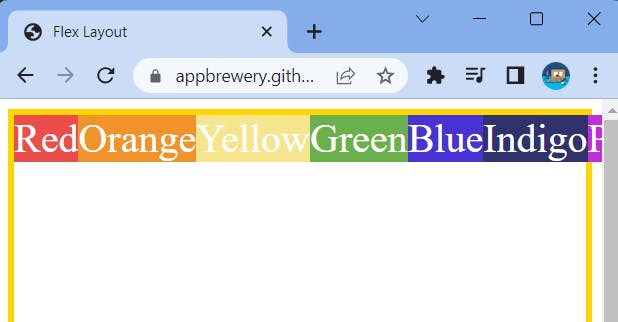
wrap: This value allows the flex items to wrap onto multiple lines if they exceed the container's width. The wrapping will occur after the last item in the line, creating new lines as necessary.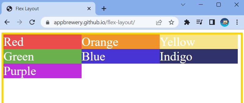
4.3) justify-content:
The
justify-contentproperty in CSS is used to align flex items along the main axis of a flex container. It controls the distribution of space between and around the flex items.Here are the different values that
justify-contentcan take:flex-start: This value aligns flex items at the start of the main axis. Forflex-direction: row, it aligns items to the left side, and forflex-direction: column, it aligns items to the top.
flex-end: This value aligns flex items at the end of the main axis. Forflex-direction: row, it aligns items to the right side, and forflex-direction: column, it aligns items to the bottom.
center: This value centers the flex items along the main axis.
space-between: This value distributes the flex items evenly along the main axis, with the first item aligned to the start edge and the last item aligned to the end edge. The remaining space is divided equally between the items.
space-around: This value distributes the flex items evenly along the main axis, with equal space before the first item and after the last item. The remaining space is divided equally between the items.
space-evenly: This value distributes the flex items evenly along the main axis, including space before the first item and after the last item, as well as between each item.

4.4) align-items:
The align-items property in CSS is used to align flex items along the cross-axis of a flex container. It controls the alignment of items that are perpendicular to the main axis.
(Note: keep Flex Wrap: to nowrap and add some height)
Here are the different values that align-items can take:
flex-start: This value aligns flex items at the start of the cross-axis. Forflex-direction: row, it aligns items to the top, and forflex-direction: column, it aligns items to the left side.
flex-end: This value aligns flex items at the end of the cross-axis. Forflex-direction: row, it aligns items to the bottom, and forflex-direction: column, it aligns items to the right side.
center: This value centers the flex items along the cross-axis.
baseline: This value aligns the items based on their baselines. The baselines are determined by the text content of the items.
stretch: This value stretches the flex items to fill the container along the cross-axis. This is the default value ifalign-itemsare not explicitly specified.
4.5) align-self:
The
align-selfproperty in CSS is used to align individual flex items along the cross-axis, independently of the alignment set by thealign-itemsproperty on the flex container.Here are the different values that
align-selfcan take:auto: This value allows the flex item to inherit thealign-itemsvalue from its parent flex container.flex-start: This value aligns the flex item at the start of the cross-axis.flex-end: This value aligns the flex item at the end of the cross-axis.center: This value centers the flex item along the cross-axis.baseline: This value aligns the flex item based on its baseline.stretch: This value stretches the flex item to fill the container along the cross-axis.(Cheat Sheet)
Conclusion
In conclusion, CSS Flexbox is a game-changer in web development, offering a simple yet powerful way to create flexible and responsive layouts. With its array of properties like display, gap, flex-direction, flex-basis, display: inline-flex, and more,